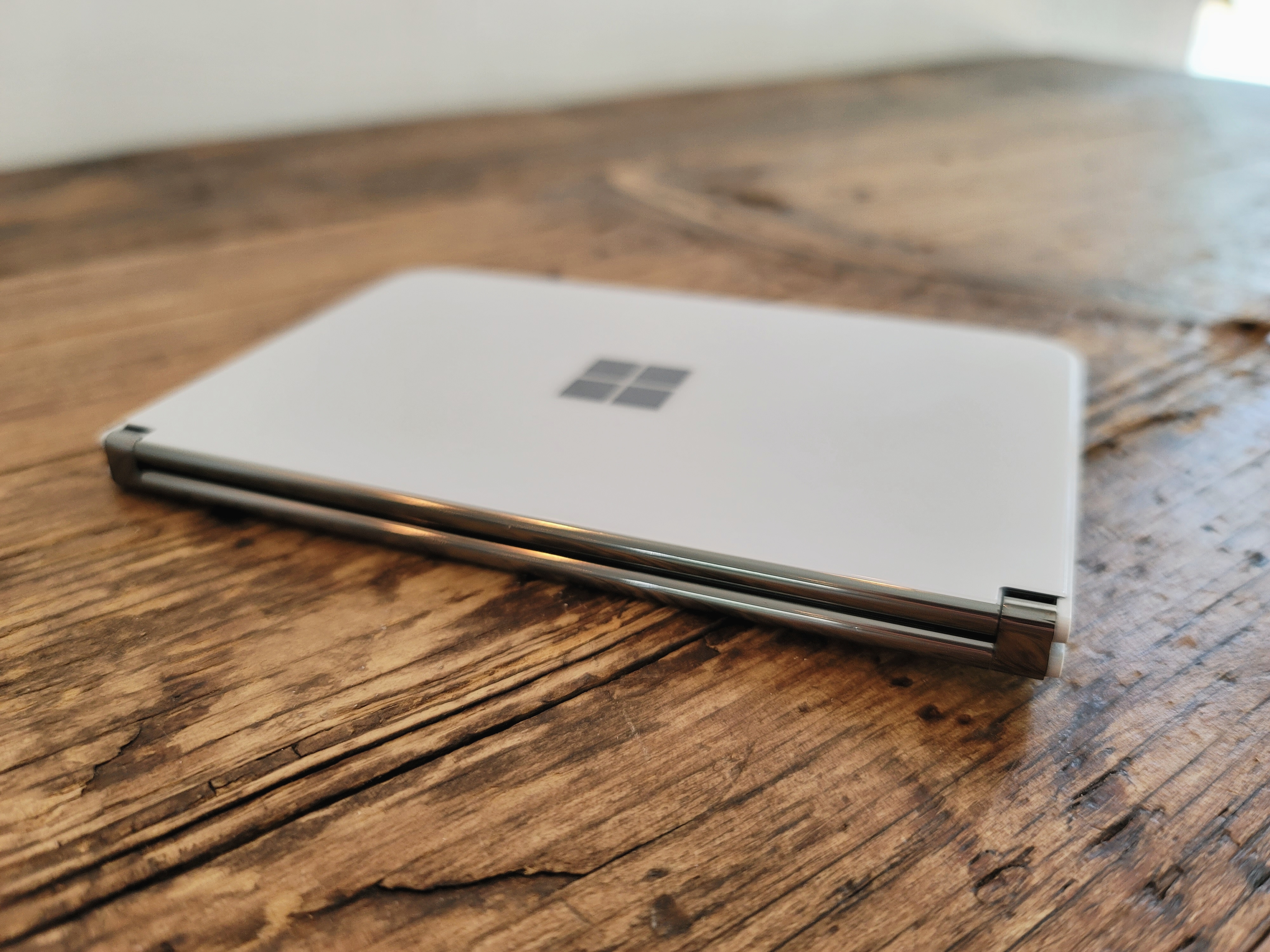
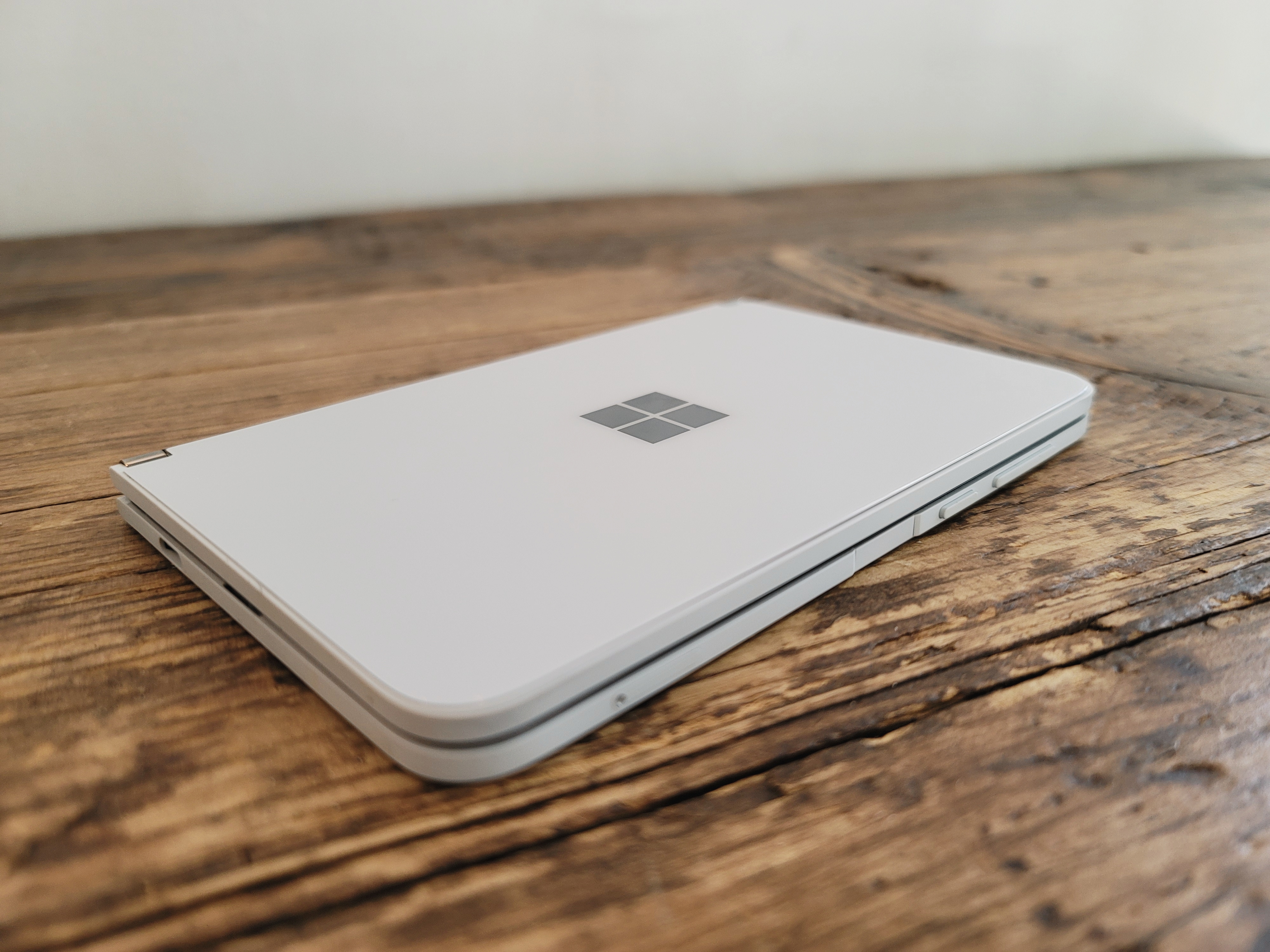
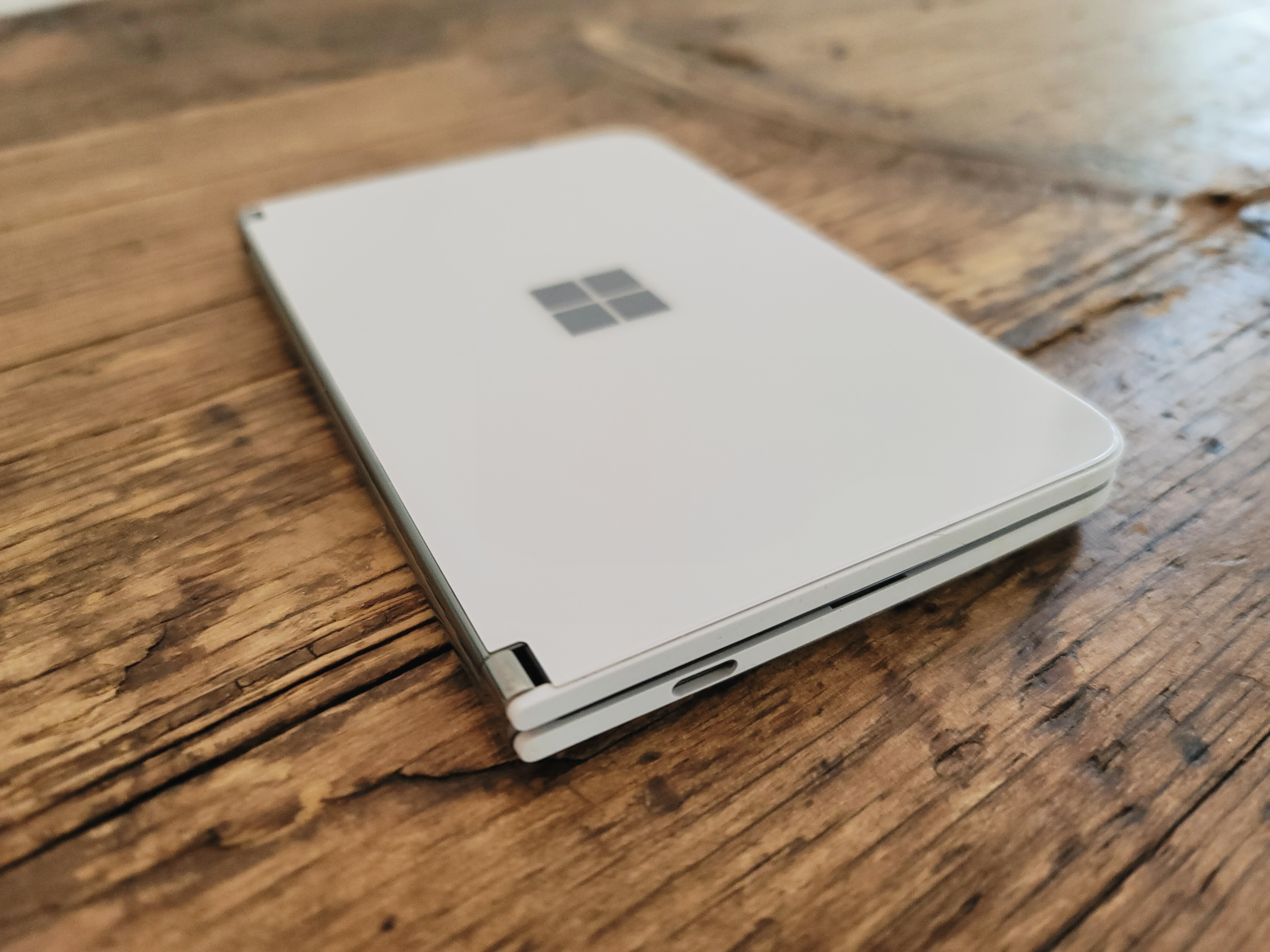
In the early days, Microsoft had misgivings about calling the Surface Duo a phone. Asked to define it as such, the company has had the tendency to deflect with comments like, “Surface Duo does much more than make phone calls.” Which, to be fair, it does. And to also be fair, so do most phones. Heck, maybe the company is worried that the idea of a Microsoft Phone still leaves a bitter taste in some mouths.
The Duo is an ambitious device that is very much about Microsoft’s own ambitions with the Surface line. The company doesn’t simply want to be a hardware manufacturer — there are plenty of those in the world. It wants to be at the vanguard of how we use our devices, going forward. It’s a worthy pursuit in some respects.
After all, for all of the innovations we’ve seen in mobile in the past decade, the category feels static. Sure there’s 5G. Next-gen wireless was supposed to give the industry a temporary kick in the pants. That it hasn’t yet has more to do with external forces (the pandemic caught practically everyone off guard), but even so, it hardly represents some radical departure for mobile hardware.
What many manufacturers do seem to agree on is that the next breakthrough in mobile devices will be the ability to fit more screen real estate into one’s pocket. Mobile devices are currently brushing up against the upper threshold of hardware footprint, in terms of what we’re capable of holding in our hands and willing to carrying around in our pockets. Breakthroughs in recent years also appear to have gotten us close to a saturation point in terms of screen-to-body ratio.
Foldable screens are a compelling way forward. After years of promise, the technology finally arrived as screens appeared to be hitting an upper limit. Of course, Samsung’s Galaxy Fold stumbled out of the gate, leaving other devices like the Huawei Mate X scrambling. That product finally launched in China, but seemed to disappear from the conversation in the process. Motorola’s first foldable, meanwhile, was a flat-out dud.
Announced at a Surface event last year, the Duo takes an entirely different approach to the screen problem — one that has strengths and weaknesses when pitted against the current crop of foldables. The solution is a more robust one. The true pain point of foldables has always been the screen itself. Microsoft sidesteps this by simply connecting two screens. That introduces other problems, however, including a sizable gap and bezel combination that puts a decided damper on watching full-screen video.
Microsoft is far from the first company to take a dual-screen approach, of course. ZTE’s Axon M springs to mind. In that case — as with others — the device very much felt like two smartphones stuck together. Launched at the height of ZTE’s experimental phase, it felt like, at best, a shot in the dark. Microsoft, on the other hand, immediately sets its efforts apart with some really solid design. It’s clear that, unlike the ZTE product, the Duo was created from the ground up.

Image Credits: Brian Heater
The last time I wrote about the Duo, it was a “hands-on” that only focused on the device’s hardware. That was due, in part, to the fact that the software wasn’t quite ready at the time of writing. Microsoft was, however, excited to show off the hardware — and for good reason. This really looks and feels nice. Aesthetically, at least, this thing is terrific. It’s no wonder that this is the first device I’ve seen in a while that legitimately had the TechCrunch staff excited.
While the Surface Duo is, indeed, a phone, it’s one that represents exciting potential for the category. And equally importantly, it demonstrates that there is a way to do so without backing into the trappings of the first generation of foldables. In early briefings with the device, Surface lead Panos Panay devoted a LOT of time to breaking down the intricacies of the design decisions made here. To be fair, that’s partially because that’s pretty much his main deal, but I do honestly believe that the company had to engineer some breakthroughs here in order to get hardware that works exactly right, down to a fluid and solid hinge that maintains wired connections between the two displays.
There are, of course, trade-offs. The aforementioned gap between screens is probably the largest. This is primarily a problem when opening a single app across displays (a trick accomplished by dragging and dropping a window onto both screens in a single, fluid movement). This is likely part of the reason the company is positioning this is as far more of a productivity app than an entertainment one — in addition to all of the obvious trappings of a piece of Microsoft hardware.

Image Credits: Brian Heater
The company took great pains to ensure that two separate apps can open on each of the screens. And honestly, the gap is actually kind of a plus when multitasking with two apps open, creating a clear delineation between the two sides. And certain productivity apps make good use of the dual screens when spanning both. Take Gmail, which offers a full inbox on one side and the open selected message on the other. Ditto for using the Amazon app to read a book. Like the abandoned Courier project before it, this is really the perfect form factor for e-book reading — albeit still a bit small for more weary eyes.
There are other pragmatic considerations with the design choices here. The book design means there’s no screen on the exterior. The glass and mirror Windows logo looks lovely, but there’s no easy way to preview notifications. Keep in mind the new Galaxy Fold and Motorola Razr invested a fair amount in the front screen experience on their second-generation devices. Some will no doubt prefer to have a device that’s offline while closed, and I suppose you could always just keep the screens facing outward, if you so chose.
You’ll probably also want to keep the screens facing out if you’re someone who needs your device at the ready to snap a quick photo. Picture taking is really one of the biggest pain points here. There’s no rear camera. Instead, I’m convinced that the company sees most picture taking on the device as secondary to webcam functionality for things like teleconferencing. I do like that experience of having the device standing up and being able to speak into it handsfree (assuming your able to get it to appropriate eye level).
[gallery ids="2043528,2043525,2043529,2043522,2043527,2043523,2043530"]
But when it came to walking around, snapping shots to test the camera, I really found myself fumbling around a lot here. You always feels like you’re between three and five steps away from taking a quick shot. And the fact of the matter is the shots aren’t great. The on-board camera also isn’t really up to the standards of a $1,400 device. Honestly, the whole thing feels like an afterthought. Perhaps I’ve been spoiled after using the Note 20’s camera for the last several weeks, but hopefully Microsoft will prioritize the camera a bit more the next go-round.
Another hardware disappointment for me is the size of the bezels. Microsoft says they’re essentially the minimal viable size so as to not make people accidentally trigger the touchscreen. Which, fair enough. But while it’s not a huge deal aesthetically, it makes the promise of two-hand typing when the device is in laptop mode close to impossible.
That was honestly one of the things I was excited for here. Instead, you’re stuck thumb-typing as you would on any standard smartphone. I have to admit, the Duo was significantly smaller in person than I imagined it would be, for better and worse. Those seeking a fuller typing experience will have to wait for the Neo.
The decision not to include 5G is a curious one. This seems to have been made, in part, over concerns around thinness and form factor. And while 5G isn’t exactly mainstream at this point in 2020, it’s important to attempt to future proof a $1,400 device as much as possible. This isn’t the kind of upgrade most of us make every year or so. By the time the cycle comes back around, LTE is going to feel pretty dated.

Image Credits: Brian Heater
Battery life is pretty solid, owing to the inclusion of two separate batteries, each located beneath a screen. I was able to get about a day and a half of life — that’s also one of the advantages of not having 5G on board, I suppose. Performance also seemed solid for the most part, while working with multiple apps front and center. For whatever reason, however, the Bluetooth connection was lacking. I had all sorts of issues keeping both the Surface Buds and Pixel Buds connected, which can get extremely annoying when attempting to listen to a podcast.
These are the sorts of questions a second-generation device will seek to answer. Ditto for some of the experiential software stuff. There was some bugginess with some of the apps early on. A software update has gone a ways toward addressing much of that, but work needs to be done to offer a seamless dual-screen experience. Some apps like Spotify don’t do a great job spanning screens. Spacing gets weird, things require a bit of finessing on the part of the user. If the Duo proves a more popular form factor, third party developers will hopefully be more eager to fine tune things.
There were other issues, including the occasional blacked out screen on opening, though generally be resolved by closing and reopening the device. Also, Microsoft has opted to only allow one screen to be active at a time when they’re both positioned outward so as to avoid accidentally triggering the back of the touch screen. Switching between displays requires doubling tapping the inactive one.
But Microsoft has added a number of neat tricks like App Groups, which are a quick shortcut to fire up two apps at once. As for why Microsoft went with Android, rather than their own Windows 10, which is designed to be adaptable to a number of different form factors, the answer is refreshingly pragmatic and straightforward. Windows 10 just doesn’t have enough mobile apps. Microsoft clearly wants the Duo to serve as a proof of concept for this new form factor, though one questions whether the company will be able to sufficiently monetize the copycats.
For now, however, that means a lot more selection for the end user, including a ton of Google productivity apps. That’s an important plus given how few of us are tied exclusively to Microsoft productivity apps these days.
As with other experimental form factors, the first generation involves a fair bit of trial and error. Sure, Microsoft no doubt dogfooded the product in-house for a while, but you won’t get a really good idea of how most consumers interact with this manner of device — or precisely what they’re looking for. Six months from now, Microsoft will have a much better picture, and all of those ideas will go into refining the next generation product.
That said, the hardware does feels quite good for a first generation device — even if certain key sacrifices were made in the process. The software will almost certainly continue to be refined over the course of the next year as well. I’d wait a bit on picking it up for that reason alone. The question, ultimately becomes what the cost of early adoption is.
In the grand scheme of foldable devices, maybe $1,400 isn’t that much, perhaps. But compared to the vast majority of smartphone and tablet flagships out there, it’s a lot. Especially for something that still feels like a first generation work in progress. For now, it feels like a significant chunk of the price is invested in novelty and being an early adopter for a promising device.
from TechCrunch https://ift.tt/33gESfx
ConversionConversion EmoticonEmoticon